Looking at reciprocal-space correlation plots, and what you can learn from them
- The Green Line
- The Yellow and White Lines
- The Relation between The Blue and Yellow Lines
- Some disasters
In an ideal world, the correlation plot would look a bit like this:
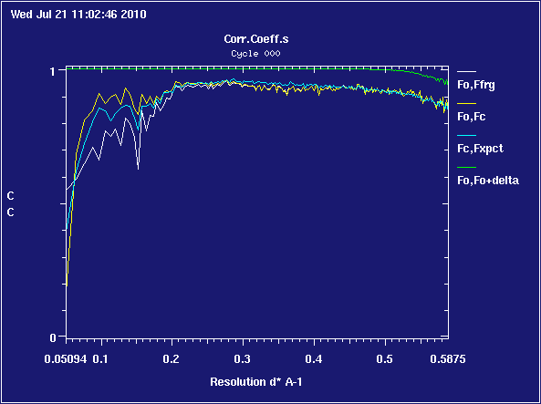
Note that the X axis is in inverse-Ångströms, so the low-resolution region (near the beam-stop) is at the left-hand side, the high-resolution region (near the detector edge) is at the right-hand side. The above plot shows a high-resolution limit of
1/0.5875 = 1.702 A
What problems can I recognize by looking at the green line?
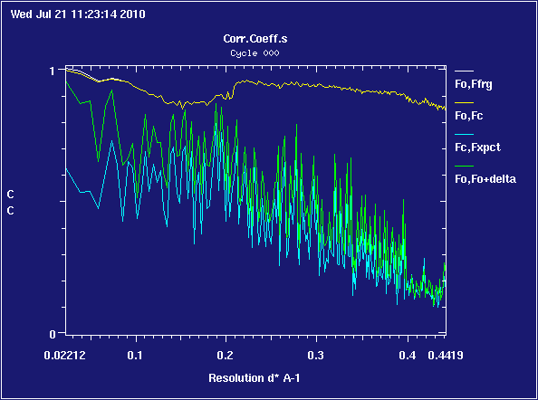
If you have ice rings in your data, there will often be 'icicle' spikes in the green line at the corresponding resolution:
The green line will invariably drop at high resolution; it is probably not sensible to use data very much beyond the point at which the green line drops below 0.9
What problems can I recognize by looking at the yellow and white lines?
If the yellow and white lines move towards zero or negative correlation in the lowest resolution bins, it is possible that your low-resolution data is defective - contaminated by overloads or hidden behind a beamstop which wasn't masked correctly at the integration stage
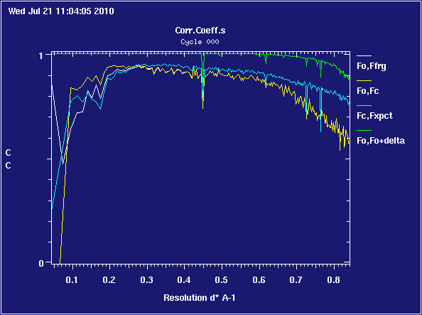
What problems can I recognize by looking at the relation between the blue line and the yellow and white lines?
The yellow and white lines differ in that the yellow line incorporates the effect of the solvent model and the white line does not; so you should expect them to run on top of one another in bins to the right of about 0.4 inverse-Ångströms, and the yellow line to be above the white line in the region between 0.1 and 0.2 inverse-Ångströms where the effects of the solvent model are most pronounced.
In an ideal world, the yellow and white lines run on top of one another, and the blue line runs on top of those.
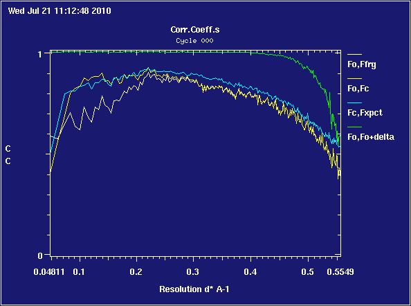
For the blue line to run persistently above or below the yellow and white lines, as
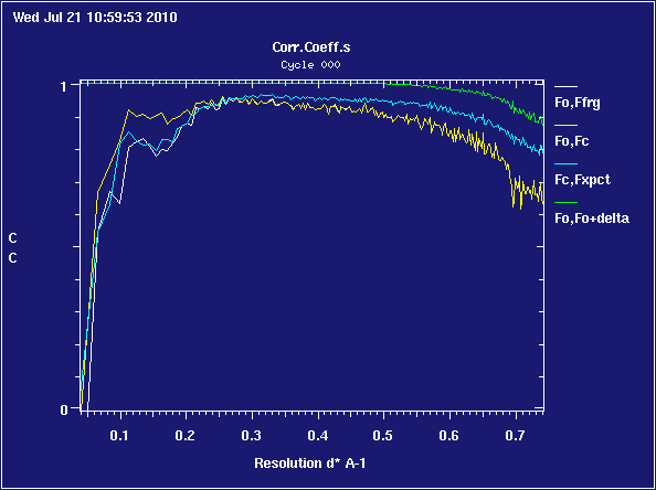
is a sign of anisotropic resolution in your data - reflections drop off faster with distance along some axes of the crystal than others - and you might want to use the Diffraction Anisotropy Server at UCLA to see if your data can be improved by taking account of this effect.
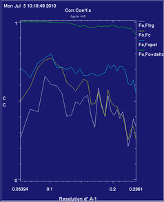 |
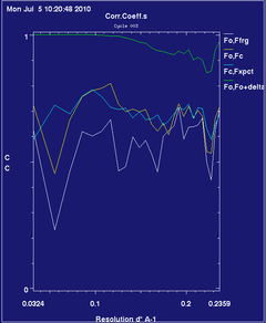 |
is an example of diffraction anisotropy scaling moving the blue line to a much more useful position relative to the yellow one ... the graph looks different from other examples because this data only goes up to about 4.1 Å; there aren't enough reflections in the bins to produce a smooth graph.
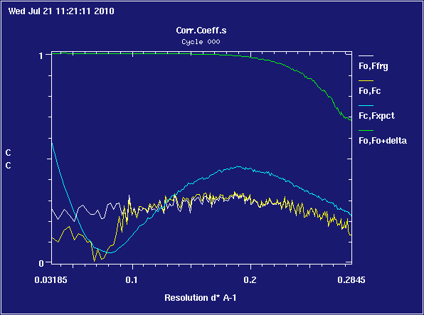
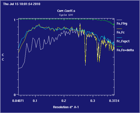
Some disasters
A selection of real problem cases:
Only 25% of the structure is modelled:
The sigmas for the data have been miscomputed in an ice-ring case:
The data turns out to be clumsily faked: